The Brown, Brown Stalks of Spring
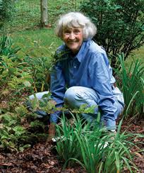
As I have noted before, I am of the camp that believes in letting perennials stand over winter, then cleaning up in spring. It tends to be better for the birds, the plants, and the beneficial insects. Some people say it looks messy. They may have a point, but I prefer messy to bare frozen earth, which I find depressing.

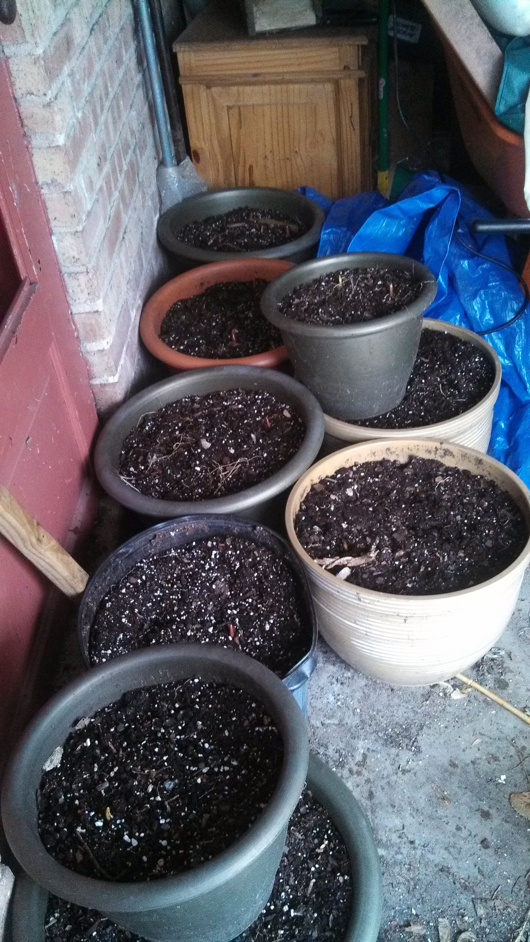
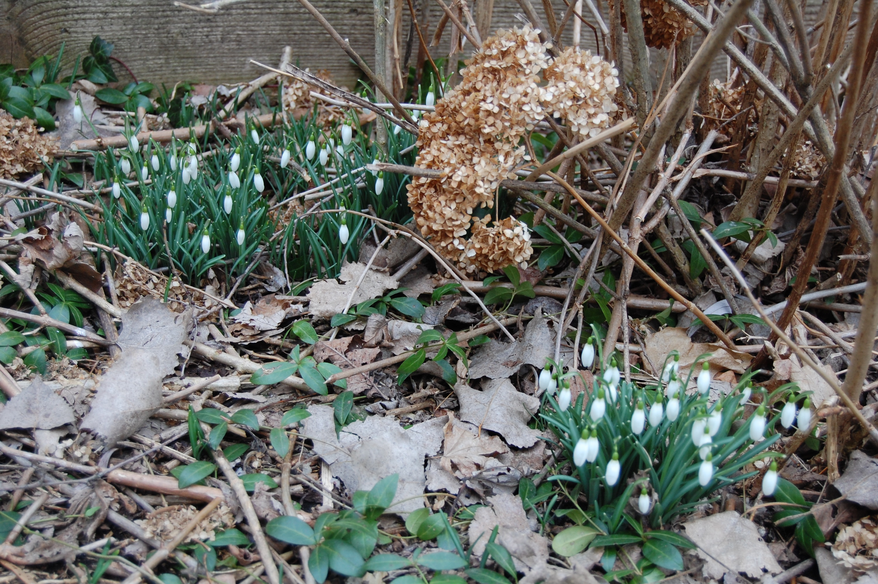
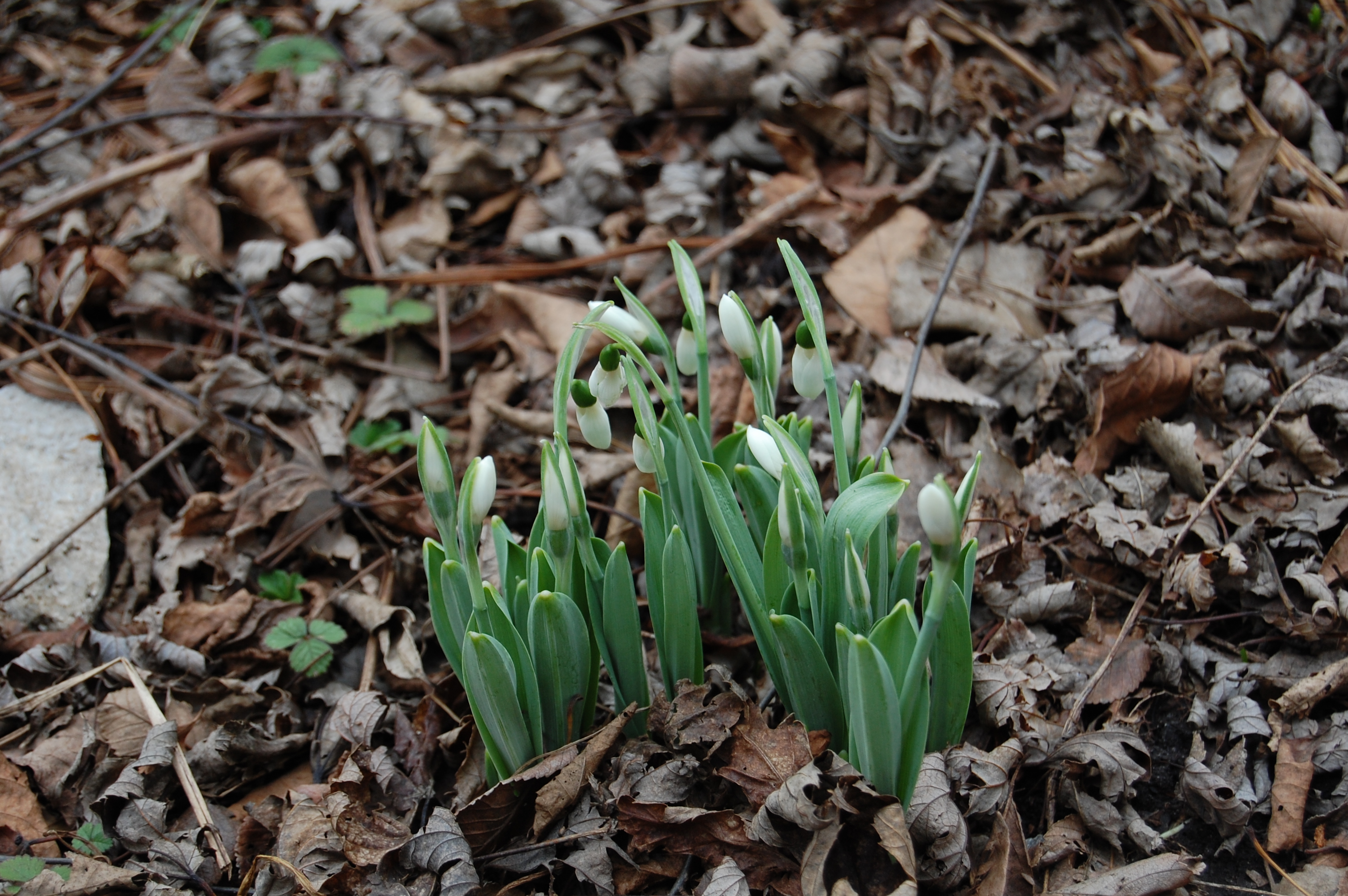
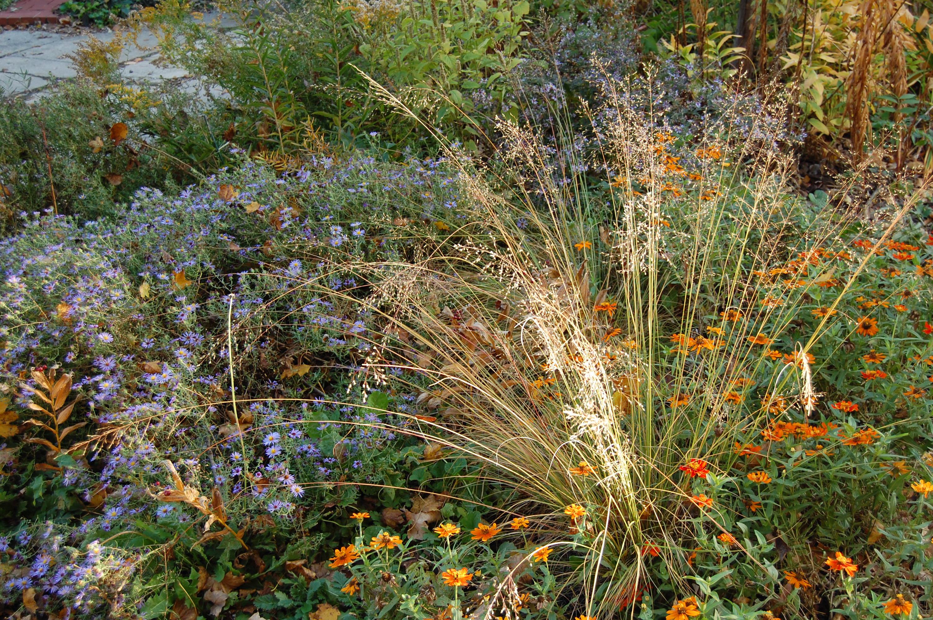
There is still the question of what to do with the dead stalks that remain when the snow melts, like ghosts of gardens past. For ghosts, they are very bulky. If you have a lot of space planted with perennials, as I do, you can generate a fairly massive quantity of what my younger son refers to as “dead stalky things”.
There are two solutions that I find unsatisfactory: the compost pile and the yard waste bag. What remains of perennials plants is mostly cellulose (if I remember my botany correctly), which will not compost well unless it has been shredded. I have been tempted to buy a shredder/chipper, but hate the idea of a gasoline powered tool in the garage.
Putting this stuff in the alley as yard waste to be picked up by the city seems just wrong. I have used the approach of placing bundles of stalks in out of the way places in the garden, to break down in nature’s own time. However, there is a limit to how much you can do this on an urban lot.

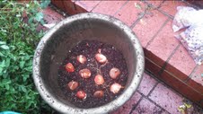
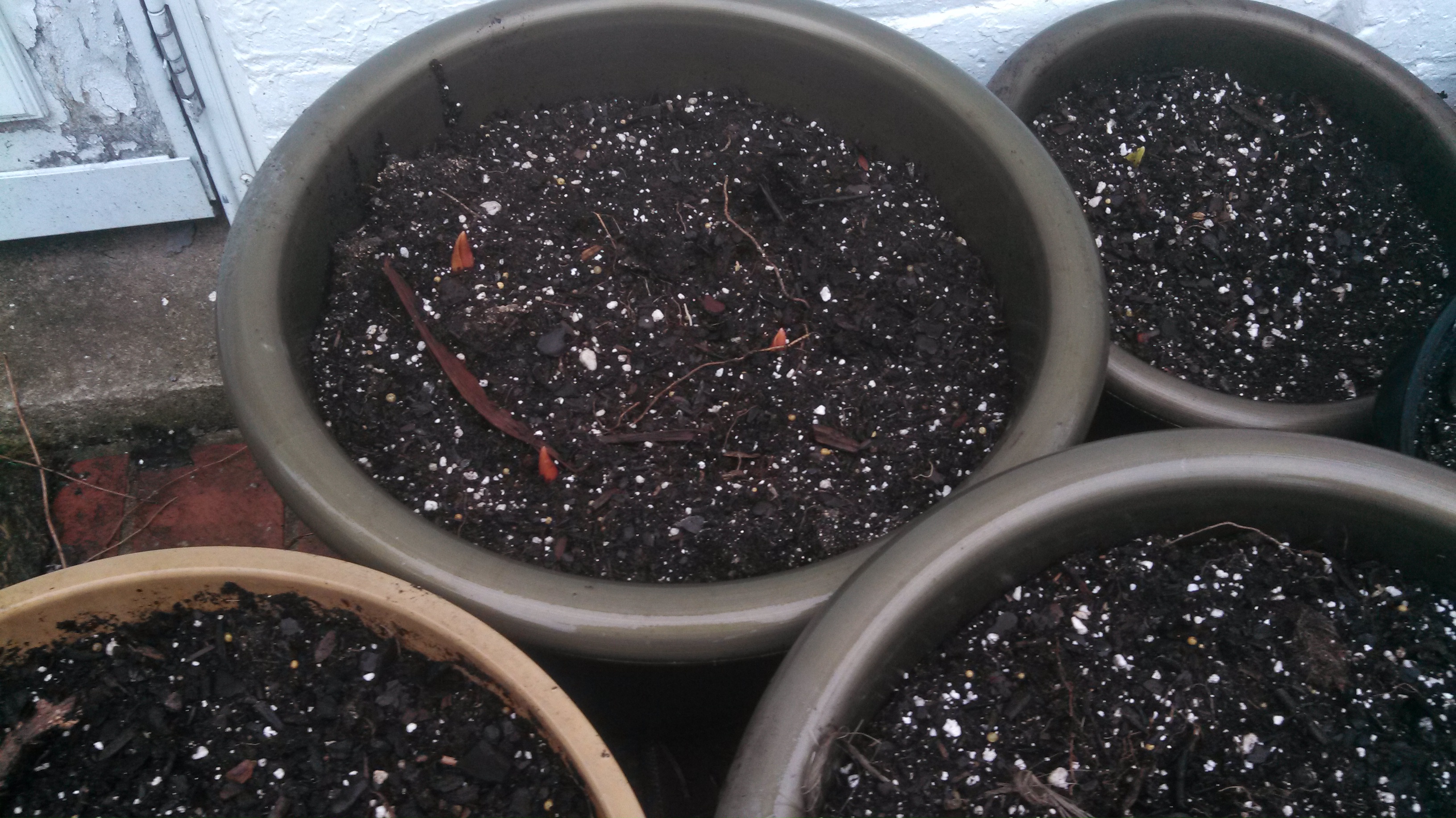
This year I am trying an approach that my brother suggested to me: just cut back the perennials in lengths of 6″ or so, and let the stalky bits fall where they may. I started putting this approach into practice last weekend, even though it was dang cold. So far I have drawn the following tentative conclusions:
Advantages:
- Good exercise for your wrists and arms.
- Gives you a head start on getting mulch down on the beds.
- You don’t have to wrestle stuff into yard waste bags.
- You are not generating solid waste.
Disadvantages:
- It’s a lot more work.
- Your beds will look messier, at least initially.
- You are inviting more volunteers from self-sowers.
- Soil may warm more slowly with if covered with more organic material.
Most of these disadvantages don’t bother me too much. For one thing, I like my garden to be at least a little messy. I suspect, though, that I won’t be able to let all the dead plant material lie on the beds, that I’ll have to pile some in out of the way corners as I have done in the past. But for now I am content to see how this approach works out.
What about you – how do you dispose of the brown, brown stalks of spring?