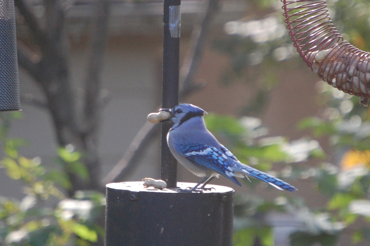
Kill the Buckthorn, Save the Frogs
The new issue of Chicagoland Gardening magazine has an article that provides more evidence that European Buckthorn (Rhamnus cathartica) is an evil plant, at least in those areas where it is invasive.
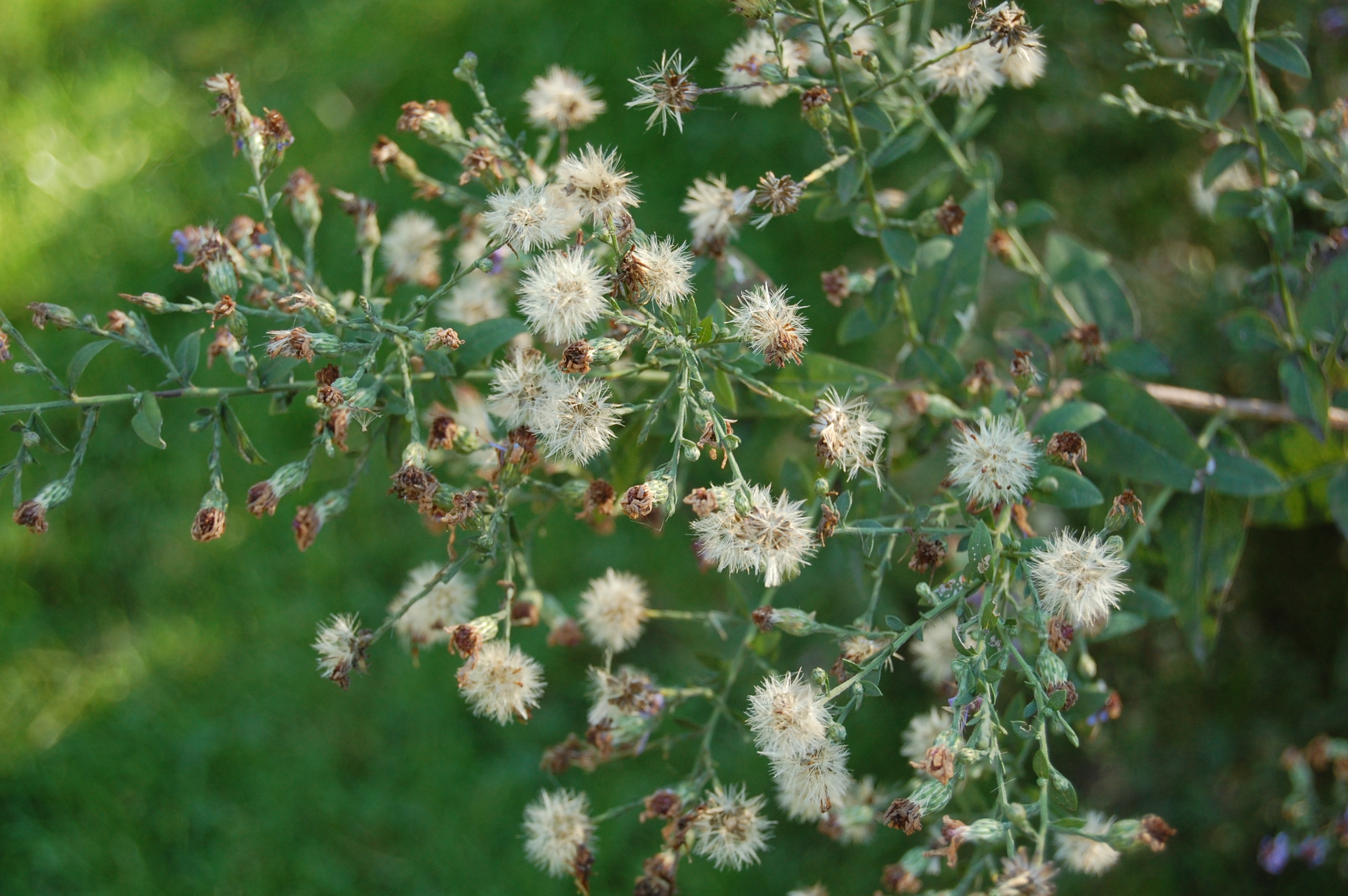
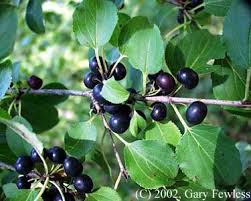
Most objections to European buckthorn are based on its impact on native plants. In much of North America, this shrubby small tree is a menace. It generates innumerable seedlings, and forms thickets that can squeeze out every other plant.
In the Chicago area alone, there are 26 million stems of buckthorn, and buckthorn removal is a constant challenge for those who seek to protect and restore natural areas.
Now it turns out that European buckthorn is a menace to frogs as well as to native plants. Buckthorn contains a chemical called emodin. Researchers from Northern Illinois University and Chicago’s Lincoln Park Zoo found emodin in ephemeral breeding pools in suburban Chicago woodlands. More buckthorn meant more emodin in the water and soil.

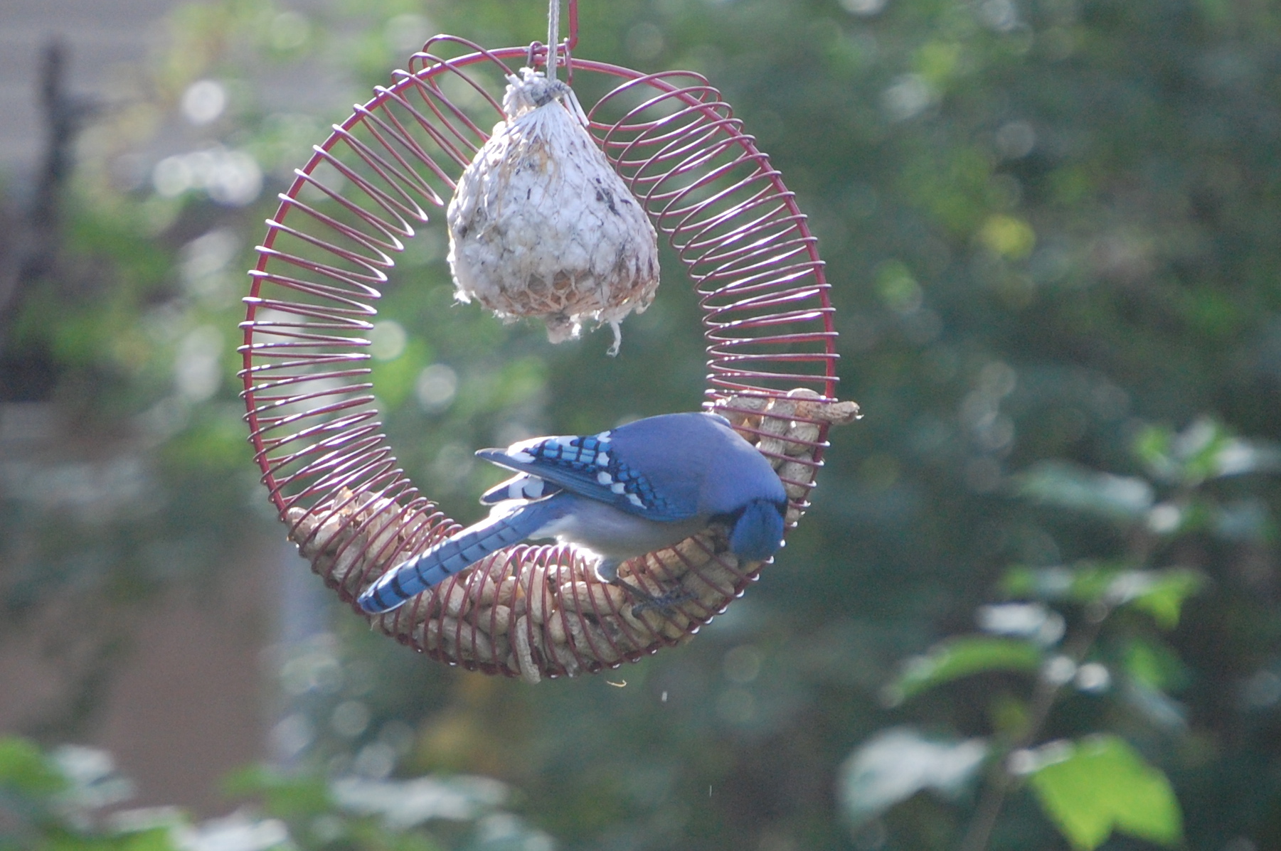
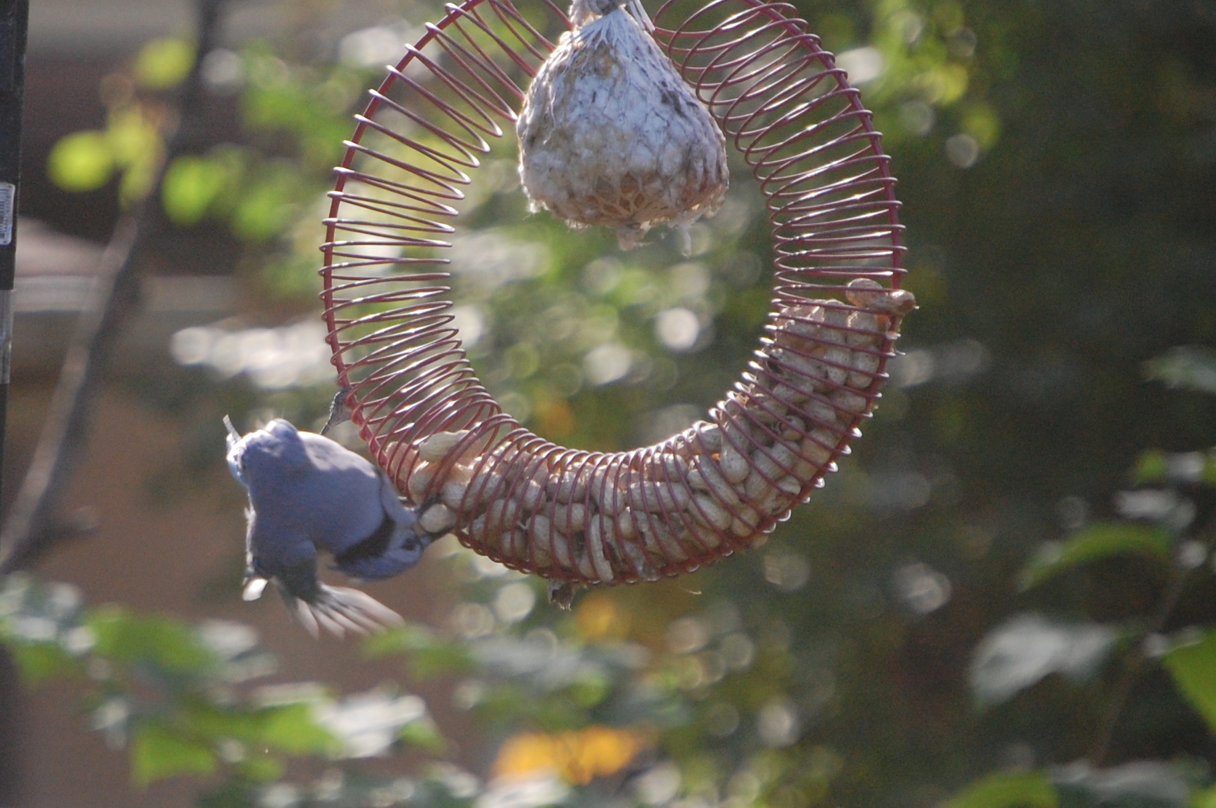
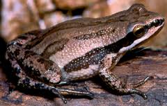
The researchers tested the effects of emodin on the tadpoles of western chorus frogs. The results: emodin caused deformities and death.
The authors of the study, which will be published in The Journal of Herpatology, hypothesize that emodin has the same impact on the tadpoles of other American frogs. Western chorus frogs are just one of several amphibian species that have low hatching rates in woods infested with European buckthorn. These species reproduce at the time of year when the concentration of emodin is highest.
Amphibians in general are facing an alarming decline. According to the conservation group Amphibian Ark, 30% of the world’s amphibian species are threatened with extinction.
I like to garden with plants native to the midwest region of North America, but I am no purist. However, when it comes to European buckthorn I have a zero tolerance policy. It’s hard to believe that these trees were once sold in nurseries. Unfortunately, it took years for people to realize the environmental impact.
After we moved into our current house I personally took down two buckthorns growing in the back garden, and I regularly pull up buckthorn seedlings.
So if you have amphibians on your property, you have another good reason to get rid of buckthorn. Do you have European buckthorn in your garden, and have you tried to remove it?