Book Review: The Gardener’s Palette, by Sydney Eddison
Late last year I got interested in trying to be more deliberate about the color schemes in my garden. Prior to that, I thought in terms of how two or three plants might fit together in terms of color, but never of a whole bed, let alone a whole garden.

When I wrote about this interest, Jayne on Weed Street recommended The Gardener’s Palette, by Sydney Eddison. Having now read this book, I can confirm that it is indeed very worthwhile for gardeners trying to think more systematically about color.
It really isn’t possible to summarize the whole book, but here are five things that caught my imagination.
Pay attention to how colors gradually meld into one another. In discussing the color wheel, Eddison notes that there are an infinite number of intermediate colors between the pure hues. You can create harmony by combining red and red violet, but add red-orange and you have created a note of contrast, because the red-violet does not share the yellow hue contained in the red-orange.
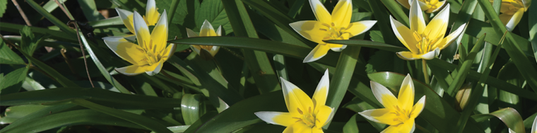
Aim for a limit of three colors. Monochromatic gardens are just too limiting for me, but there is definite value in trying to limit the number of colors, with three being a good goal to aim for. I have to confess my lust for possessing many different plants makes this difficult. However, in my front driveway flower bed I should get pretty close next year. In spring: red, yellow, blue. In summer: blue, orange, yellow, with accents of red and white. And in fall, blue, yellow, and purple-pink.
Pay attention to intensity. Red is generally an intense color, so a little bit goes a long way. That’s why I generally don’t use more than a splash of it in my beds. In addition, intense colors can be tamed by using the related tints (mixed with white), shades (mixed with black), and tones (mixed with gray). Using a higher ratio of softer colors like blue prevent intense colors from overwhelming, while at the same time making them more effective through contrast. Green and silver/gray can also pull contrasting colors together, preventing contrast from turning into open warfare.
Use complementary colors. I was very interested in Eddison’s discussion of colors that are opposite each other on the color wheel, or complementary. When presented with a lot of one color, the eye naturally seeks out its complement. This is why complementary colors, like orange and blue, look right (to me, anyway) – in effect, they complete each other. They also provide contrast, which I personally find to be a necessity because too much harmony is just boring.
Look to art and nature for ideas. Natural landscapes present us with many color schemes that can be translated to the garden with great effectiveness. Similarly, a great deal of inspiration can be found in paintings, and not just landscapes.
The photography in The Gardener’s Palette is worth an unhurried examination, as it effectively illustrates the points made in the text.
The author stresses that the critical thing is to look carefully at the color in our gardens and in the world around us with a perceptive and appreciative eye.


Interesting. I will have to take a look at this book. Thanks for the review.
I found it very worthwhile.
Sounds like an interesting book. Have you read ” Colour by Design ” by Nori and Sandra Pope? I´m beginning to think a lot about colours schemes in my garden. Before I just put plants where there was space, but it´s beginning to be better.
No, I’m not familiar with the book you mention. I’m the same as you, at first I was kind of an impulsive gardener, but feel the need for more of a thoughtful, planned approach.
One mistake that is often made is using too much color. Using whites, silvers and grays give the eye a chance to rest before going back to the “busier” colors. Soft pastel pinks and blues also help. “Perennial Combinations” by C. Colston Burrell is another excellent book on this subject.
I also like to use white and blue to rest the eye. I was surprised that Eddison does not like to use white in this way, thinking it is too much of a contrast.
Thanks for the info. I’ve read several of Sydney’s other books but not this one. She’s an inspiring gardener, as well as a terrific writer.
As others have mentioned, I find silver and gray foliage useful as a bridge between bright colors. However, I think white is too bold for this purpose. It just doesn’t work for me…perhaps because the sun is more intense in the South.
As I wrote above, Eddison agreed with you about white. For myself, I had always thought of it as a calming color. Now I’m not sure.
This sounds like a great book! I like a lot of color, too, and have always found it difficult to stick with a set color scheme. But your plan of having one color scheme for spring, another for summer, and another for fall is inspiring! This book is going on my wish list! Thanks for joining in!
Well having different colors in different seasons wasn’t exactly a plan initially, it just worked out that way.
My garden transforms through the seasons with different colors, from soft pinks in Spring through reds in Summer, then blues in Fall. I had the three color palette in a previous design, but I get so many hand me down plants from jobs, that the color is many now. This book is well done.
I always tell people when choosing color for outside, look to inside – the colors that you decorate with in fabrics and rugs (look at the color mixes in the patterns). They are colors you are happy to live with and can be translated to outdoors.
When you do this, it makes a great indoor/outdoor transition from a design perspective. Fabric designers are very good at making colors that work well with each other. I used the colors in the rugs in my dining room for summer color, the colors in my kitchen for Fall. Big windows and French doors make the connection from inside to outside.
This is a simple way for those unfamiliar with color theory to design on their own, because each color you look at has more than one color within. It is why we see blue/reds, or orange/reds for instance. Every color has color undertone. It takes much experience to understand those relationships. How you tell undertones is by side by side comparison. One will always be darker and towards a cooler undertone, even if you think it is a warm color in the first place.
The idea of the color undertone, and colors mixing in different degrees is definitely an idea that this book stresses. I agree it can be very hard to limit the number of colors because it is very hard to say no to an appealing plant, whether they fit into a color scheme or not.
Sounds like a very interesting book and you have given us some great advice. I will look at my garden with new eyes and a different purpose this summer.
That’s what I am trying to do.
I also read and listen to garden shows about color schemes. But, I have to be honest and tell that I never pay attention. I love colors and want all the colors of nature in my garden (if that is possible and if I have the money) :-).
I wouldn’t say that I never pay attention, but I do find it a challenge to focus on issues related to color schemes, and yet I feel a desire to do so.
Jason, I guess it’s a very interesting book and garden theme. I do try to have red and white colors or blue and white. The white color suits to any other, exept yellow.
Red, blue, and white are fine colors, and also the colors of the Russian and USA flags!
After creating my perennial beds with my favorite flowers, this book would help me add a more deliberate method to my madness. A great recommendation…thank you!
You’re welcome. Achieving a more deliberate method to my madness – well put – that is exactly what I am trying to do.
What an enjoyable garden book review!
Thank you, glad you liked it!
Interesting and very informative review of the book, sir. Thank you for sharing. =)
Sounds like a really useful book. My husband bought me a gardener’s colour wheel a few years back and I’ve found it really interesting to see which colours match up and how it notes the differences in shades and tones. Like you, I collect plants so unfortunately while I have tried to plan for colour I thwart my own plans quite easily by coming home from the nursery with unexpected flowers.
I do well with size, shape and texture. Colour, on the other hand, overwhelms me. I’m a visual learner too, so must have pictures. Perhaps this book can help me.
I had made a promise I was done buying garden books for a while but this one is a must…thanks for the review!!
Not that I ‘need’ another gardening book to add to my collection, but this could be one that I actually do need! I love colour and just mash things together in my own way. This year I want to learn a lot more about getting the best from my mashed up planting schemes. Your blog is great for this because I think you have a wonderful sense of colour and planting and I think the books sounds good too! 🙂 Thanks Jason!